
Sjoerd Faesen
Lanaken, BE
sjoerd@idea8.be
Fintech
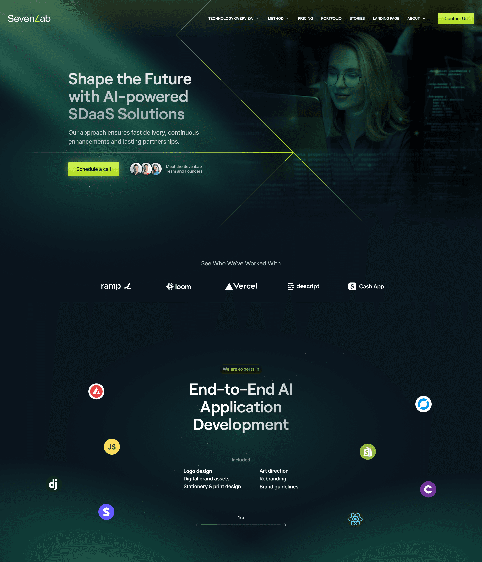
Digital Product Design Solution
With user-centered approach, the goals was to create an intuitive interface for effortless financial management while incorporating gamification.
With user-centered approach, the goals was to create an intuitive interface for effortless financial management while incorporating gamification.


Role
Role
Industry
Industry
FinTech
FinTech
Duration
Duration
2022-2023 (active design involvement ± 12 months)
2022-2023 (active design involvement ± 12 months)
2022-2023 (active design involvement ± 12 months)
Company size
Company size
50-101
50-101
50-101
Challenge
The app had a cluttered interface, making it difficult for users to navigate and find essential features. Users were facing issues with the onboarding process, which was affecting new user adoption rates. The app lacked personalization and customization options, making it less engaging and user-friendly.
Results
The redesigned app features a clean, clutter-free interface, making it easier for users to navigate and access essential features.The improved onboarding process resulted in a 35% increase in new user adoption rates.The addition of personalization and customization options enhanced user engagement, leading to a 25% increase in user retention rates.
35%
Improved Onboarding Process
25%
Increase in User Retention
84%
Increase in Time Spent on Website
What we learned
How might we
Solutions
Simplifying how users onboard, join organisations, and migrate from legacy tools. By unifying personal accounts with multi-organisation access, we removed friction during setup and allowed users to seamlessly switch context without juggling multiple logins.
View the process
View the process
↴
↴
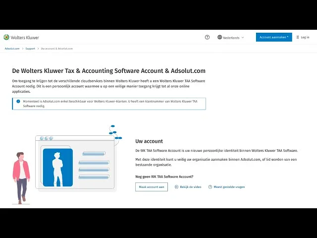
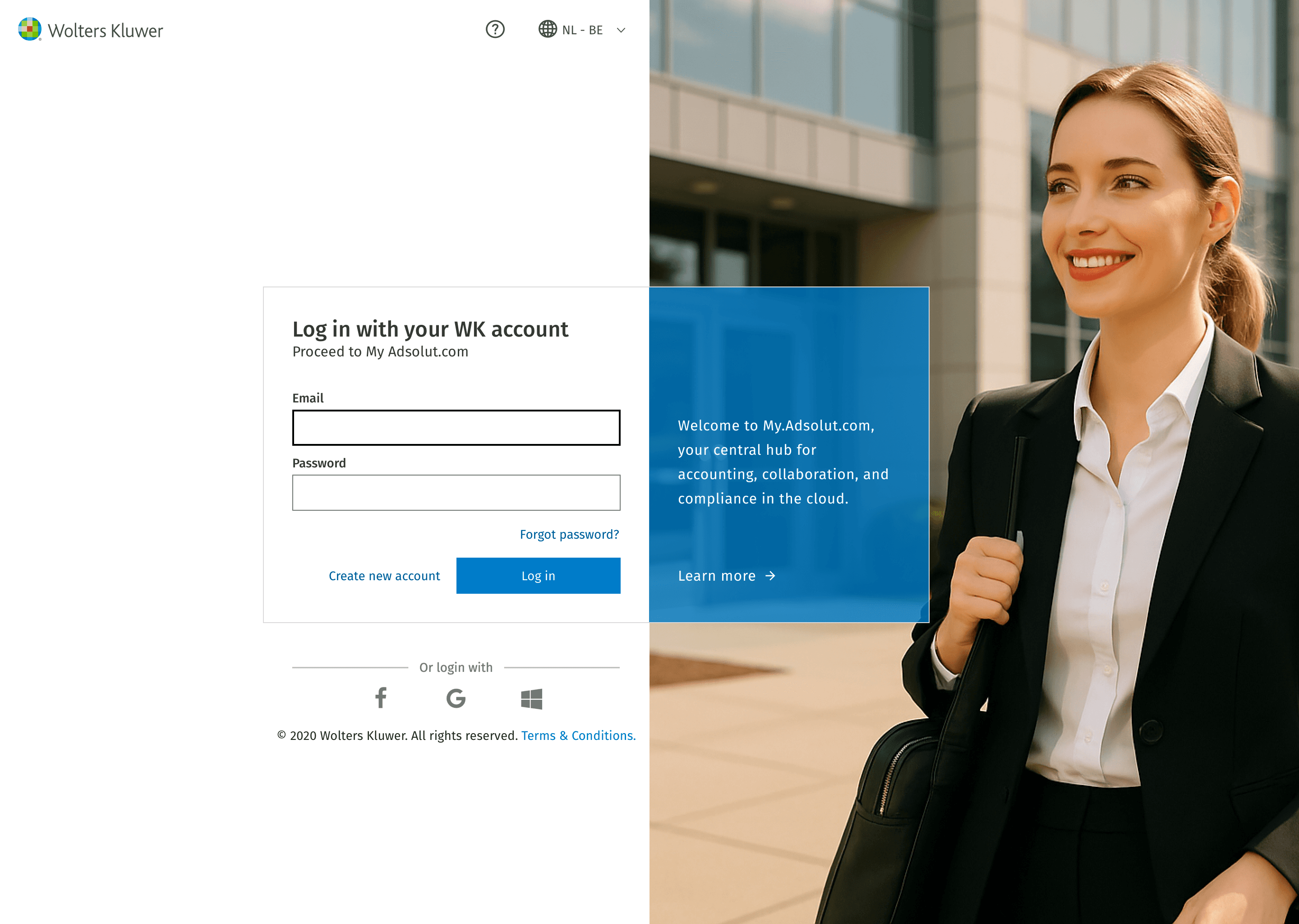
User onboarding
Research showed clients often belonged to multiple organisations. We solved this by allowing users to onboard with their personal email, join several organisations, and switch context at any time within the platform. No more logging in and out per client!
E.g. “As an independent contractor, I can do maintenance for multiple organisations.”
Guiding the user
Initial prototype feedback indicated users struggling with complex concepts like accounts, organisations, roles, and products. We introduced educational pages with clear overviews, videos, and FAQs to support understanding and reduce support needs.
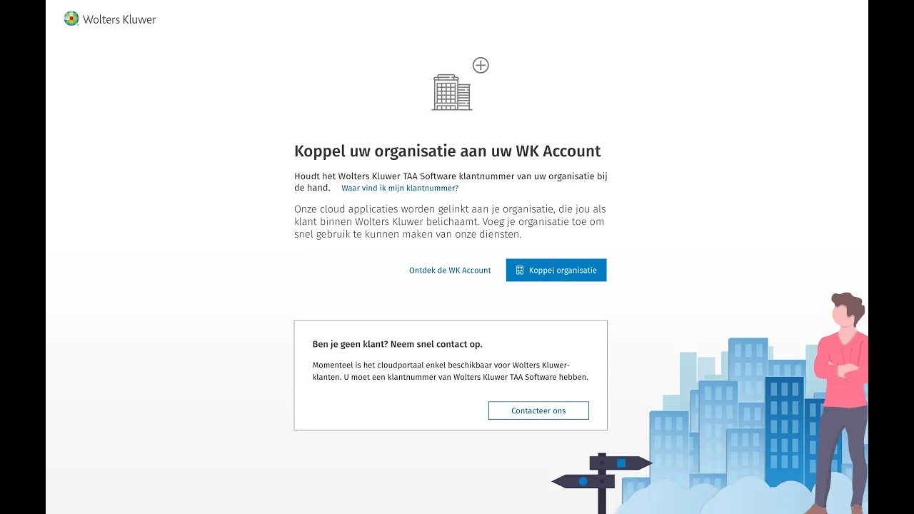
Verifying an organisation
Anyone can register and create organisations, but for some services the business required verifying users as legitimate WK clients. We solved this with a parallel track that whitelists organisations via customer ID.
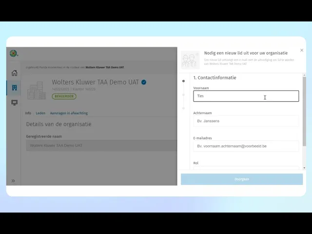
Roles and organisations
Roles like admin or member define access to apps and data within each organisation. Since a separate organisation management platform already existed before I joined, I focused on ensuring everything was logically connected and consistent across the user experience.
Subscriptions & seat management
Redefining how organisations subscribe, assign seats, and manage access across products. By simplifying flows, surfacing key information, and supporting real-world account structures, we made complex licensing logic feel intuitive for both admins and end users.
View the process
↴
↴
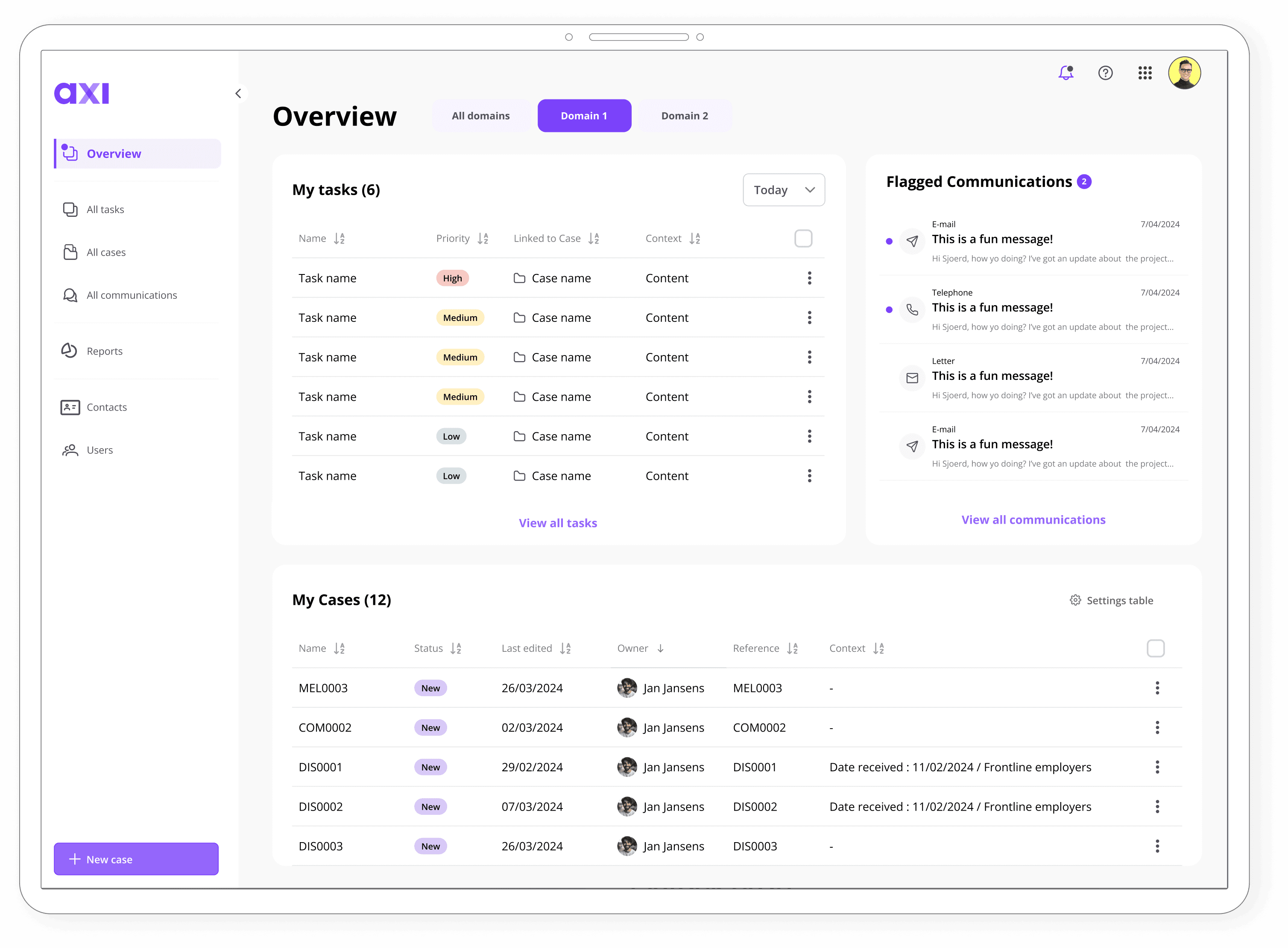
Central dashboard overview
The business needed clear separation between product access and purchase rights. We designed a central dashboard that shows users only what’s relevant to their role. Admins can view subscriptions and start purchase flows, while regular users simply access the products assigned to them. Each product card shows key info like status and trial availability.
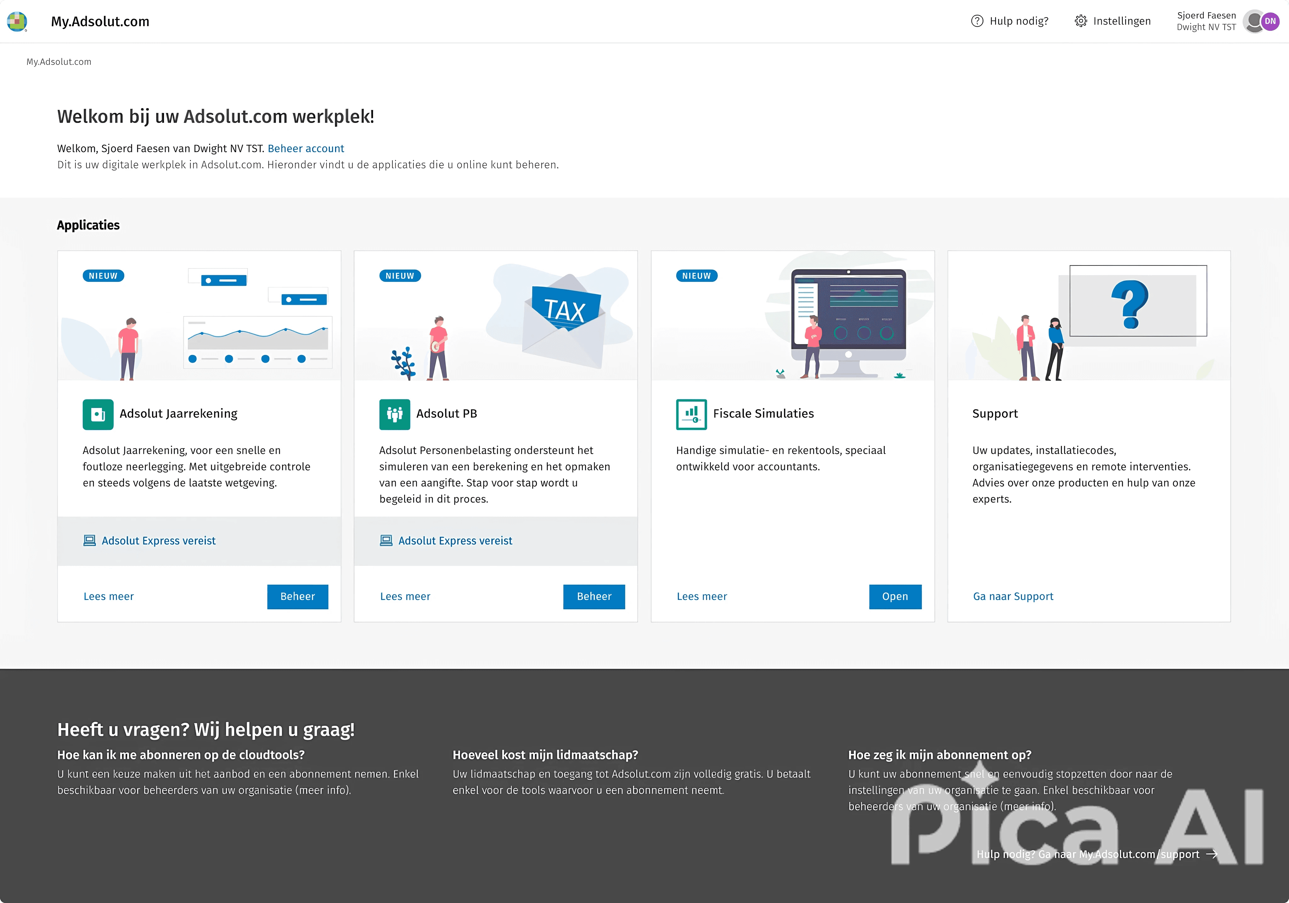
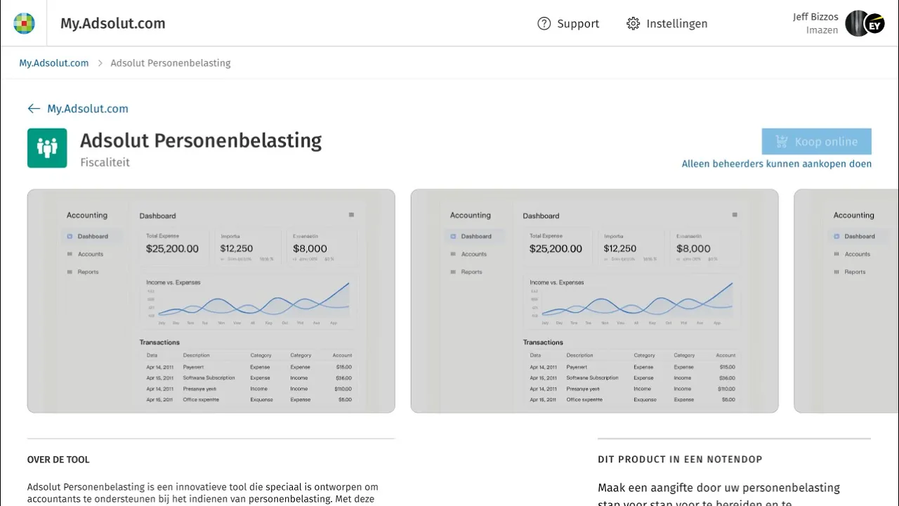
Product info & pricing
Each product page provides detailed information about the product, its features, and subscription status. Depending on the user’s role, admins can see pricing, seat management options, and initiate a purchase, while users only see their personal access. The product page acts as the main entry point into the purchase or management flow, keeping complex licensing logic hidden until it’s relevant.
Sjoerd Faesen - Senior/Lead UX Designer
10 years of UX design experience on your side
sjoerd@idea8.be
Sjoerd Faesen - Senior/Lead UX Designer
10 years of UX design experience on your side
sjoerd@idea8.be
Sjoerd Faesen
Senior/Lead UX Designer
10 years of UX design experience on your side
sjoerd@idea8.be